同樣,想看課堂講義請參考:R Graphics with Ggplot2 - Day1
想要更深入的可以參考這個網站:R for Data Science
上篇請看這:Ggplot | Point plot & Box plot
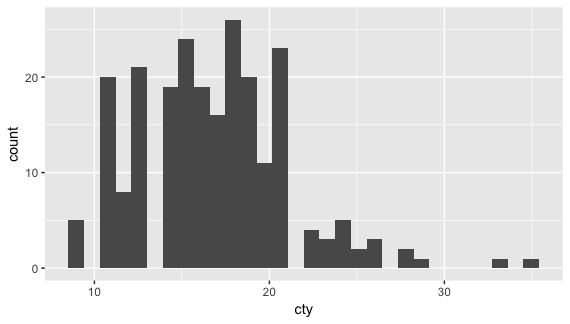
3. Histogram: geom_histogram()
Histogram 呈現的是單一數字參數的分佈情形,也就是只有 X-axis 是 variable,Y-axis 則是 X-axis 的數據。
|
ggplot(mpg, aes(cty)) + geom_histogram() |
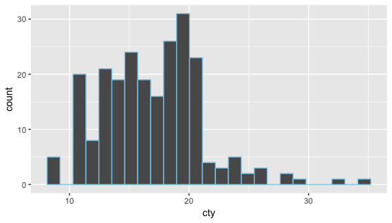
可以改每條的寬度,用 bins = 或是 binwidth =,放在 geom_histogram() 裡面。
bins 是數字越小越寬,預設是 30,我覺得剛剛好的寬度大概是 25 左右。
|
ggplot(mpg, aes(cty)) + geom_histogram(bins = 25, color = 'skyblue') |
可以指定顏色,要放在 geom_histogram() 裡面,放在 ggplot() 裡面沒作用。
單用 color =' ' 的話是外筐的顏色。
binwideth 的話是數字越大越寬,預設是 1。
指定顏色一樣是放後面,color = ' ' 只有外筐,裡面顏色是用 fill = ' ' 。
|
ggplot(mpg, aes(cty)) + geom_histogram(binwidth = 1.5, color = 'pink', fill = 'skyblue') |

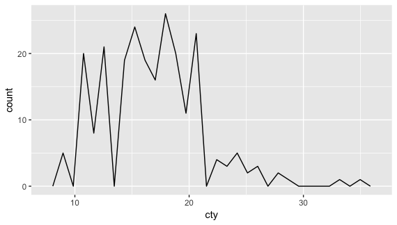
4. Frequency poligons: geom_freqpoly()
這個和 histogram 是一樣的,只是它是線條。
寬度的變化一樣是用 bins 或 binwidth。
|
ggplot(mpg, aes(cty)) + geom_freqpoly() |
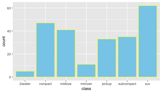
5. Bar graph: geom_bar()
和 histogram 不一樣的是 bar graph 的 X-axis 需要是 text (character),例如 drv, class 和 manufacturer。顏色一樣是放後面。
|
ggplot(mpg, aes(class)) + geom_bar(color = 'yellow', fill = 'skyblue') |
6. Line graph: geom_line()
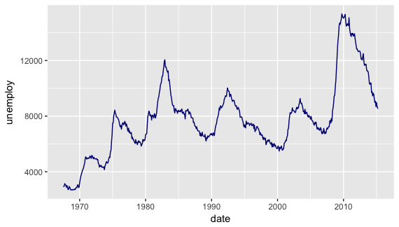
一連串的數字通常是用線圖,例如經濟成長圖、失業或就業率圖等等。
這裡用檔案資料 economics:data(economics)。
|
ggplot(economics, aes(date, unemploy)) + geom_line(color = 'navy') |
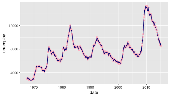
也可以兩種一起呈現,例如 line + point。
|
ggplot(economics, aes(date, unemploy)) + geom_point(color = 'pink') + geom_line(color = 'navy') |
最後有兩個練習,有一個要用到檔案 diamonds,有興趣的可以試試。
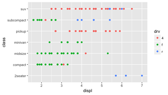
Exercise 1: How is the drive train related to engine size and vehicle class?
|
ggplot(mpg, aes(displ, class, colour = drv)) + geom_point() |
Exercise 2: Exercise: How does the price distribution in diamonds vary by cut?
| data(diamonds) ggplot(diamonds, aes(price, colour = cut)) + geom_freqpoly(bins = 50) |

圖的部分大概是這六種,接下來下篇要介紹的是加趨勢線。
【 其他參考資料 】
R Graphics Cookbook - Chapter 3: Bar Graphs
沒有留言:
張貼留言
歡迎發表意見