這篇介紹另外幾個處理資料的功能,上篇請看這裡:
R | Data manipulation (1): select, filter, slice
詳細功能介紹請參考這兩頁:
Working with Data - Part 1 &
Intro to R - Part 3
練習的部分可以參考 slides:
Working with Data - Part 1 (pdf)
這幾個功能在 dplyr 這個 package 裡面,所以要先跑。同時要用內建檔案 mtcars 來練習,所以也要叫出來。下面還會用檔案資料 flights,因為它在 nycflights13 這個 packages 裡面,所以也需要安裝。
library(dplyr)
library(nycflights13)
mtcars
flights |
下面先介紹一個觀看檔案的功能。
Glimpse function: columns run down the page, and data runs across, making it possible to see every column in a data frame
glimpse() 和平常看檔案的方式不一樣。我們平常看檔案的時候,variables 是在第一列(rows),每個欄位(column)是一個 variables。但用 glimpse() 的話,它會橫向顯示每個 variable 的數據值。
下面先用資料檔案 flights 練習。
dim: 顯示檔案資料的大小 dimension (row x column)
上面顯示的結果告訴我們,共有 336776 個班機(observations),且用 19 個 variables 呈現各個班機的資訊。
Observations: 336,776
Variables: 19
$ year <int> 2013, 2013, 2013, 2013, 2013, 2013, ...
$ month <int> 1, 1, 1, 1, 1, 1, 1, 1, 1, 1, 1, 1, ...
$ day <int> 1, 1, 1, 1, 1, 1, 1, 1, 1, 1, 1, 1, ...
$ dep_time <int> 517, 533, 542, 544, 554, 554, 555, ... |
上面用 glimpse() 功能可以看到每班飛機的資訊(variables)包括有 year, month, day, dep_time 等等。
5. Arrange function: order observations (rows)
沒特別指令的話會由小到大排列。
Default setting: order mpg values from small to large. (依 mpg 的大小排列)
mpg cyl disp hp drat wt qsec vs am gear carb
1 10.4 8 472.0 205 2.93 5.250 17.98 0 0 3 4
2 10.4 8 460.0 215 3.00 5.424 17.82 0 0 3 4
3 13.3 8 350.0 245 3.73 3.840 15.41 0 0 3 4
4 14.3 8 360.0 245 3.21 3.570 15.84 0 0 3 4
5 14.7 8 440.0 230 3.23 5.345 17.42 0 0 3 4 |
如果要由大到小排列的話,則用:
desc()
Use desc() to sort in descending order.
Order mpg from large to small.
| arrange(mtcars, desc(mpg)) |
mpg cyl disp hp drat wt qsec vs am gear carb
1 33.9 4 71.1 65 4.22 1.835 19.90 1 1 4 1
2 32.4 4 78.7 66 4.08 2.200 19.47 1 1 4 1
3 30.4 4 75.7 52 4.93 1.615 18.52 1 1 4 2
4 30.4 4 95.1 113 3.77 1.513 16.90 1 1 5 2
5 27.3 4 79.0 66 4.08 1.935 18.90 1 1 4 1 |
如果有兩個 variables 的話,會先排第一個,然後再在第一個裡面排第二個的大小順序。
mtcars %>%
arrange(cyl, gear) |
Arrange with cyl first; then within cyl, arrange gear.
上面的例子中,會先依照 cyl 的大小排列,再依 gear 的大小排列。
mpg cyl disp hp drat wt qsec vs am gear carb
1 21.5 4 120.1 97 3.70 2.465 20.01 1 0 3 1
2 22.8 4 108.0 93 3.85 2.320 18.61 1 1 4 1
3 24.4 4 146.7 62 3.69 3.190 20.00 1 0 4 2
4 22.8 4 140.8 95 3.92 3.150 22.90 1 0 4 2
5 32.4 4 78.7 66 4.08 2.200 19.47 1 1 4 1 |
如果想讓兩個 variables 都由大到小排列,可以分開寫,也可以合在一起。
Reorder the mtcars in descending order of mpg and displacement (disp)
mtcars %>%
arrange(desc(carb), desc(mpg)) |
或寫成這樣:
mtcars %>%
arrange(desc(carb, mpg)) |
mpg cyl disp hp drat wt qsec vs am gear carb
1 15.0 8 301.0 335 3.54 3.570 14.60 0 1 5 8
2 19.7 6 145.0 175 3.62 2.770 15.50 0 1 5 6
3 21.0 6 160.0 110 3.90 2.620 16.46 0 1 4 4
4 21.0 6 160.0 110 3.90 2.875 17.02 0 1 4 4
5 19.2 6 167.6 123 3.92 3.440 18.30 1 0 4 4
6 17.8 6 167.6 123 3.92 3.440 18.90 1 0 4 4 |
從上面可以看到是先依 carb 的大小排列,之後再依 mpg 的大小排列(最後四排當 carb 都是 4 的時候,mpg 是由大到小排列),但兩個都是由大到小。
Exercise
這邊我們用檔案資料 flights 來練習。
Q1. Which flights are the most delayed?
哪個班機起飛時間延遲最多,可以用 desc() 由大到小排列延遲的長度,第一個就是延遲最多的。下面先用 glimpse 呈現結果。
flights %>%
arrange(desc(dep_delay)) %>%
glimpse |
Observations: 336,776
Variables: 19
$ year <int> 2013, 2013, 2013, 2013, 2013, ...
$ month <int> 1, 6, 1, 9, 7, 4, 3, 6, 7, 12, 5, 1, 2, ...
$ day <int> 9, 15, 10, 20, 22, 10, 17, 27, 22, ...
$ dep_time <int> 641, 1432, 1121, 1139, 845, 1100, 2321, ...
$ sched_dep_time <int> 900, 1935, 1635, 1845, 1600, 1900, 810, ...
$ dep_delay <dbl> 1301, 1137, 1126, 1014, 1005, 960, ... |
從上面顯示的最後一行 dep_delay 可以看到是由大到小排列。
如果不確定哪個 variable 是指延遲時間的話,可以用
? 或
help() 的功能來查看:
?flights 或是
help(flights)。
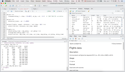
會在 R Studio 右下角的視窗中出現解釋框(如下圖,點圖可以放大),裡面寫:
dep_delay, arr_delay:
Departure and arrival delays, in minutes. Negative times represent early departures/arrivals.
|
下面是沒用 glimpse() 功能呈現,應該會比較清楚。
| arrange(flights, desc(dep_delay)) |
# A tibble: 336,776 x 19
year month day dep_time sched_dep_time dep_delay arr_time
<int> <int> <int> <int> <int> <dbl> <int>
1 2013 1 9 641 900 1301 1242
2 2013 6 15 1432 1935 1137 1607
3 2013 1 10 1121 1635 1126 1239
4 2013 9 20 1139 1845 1014 1457
5 2013 7 22 845 1600 1005 1044
6 2013 4 10 1100 1900 960 1342
7 2013 3 17 2321 810 911 135
8 2013 6 27 959 1900 899 1236
9 2013 7 22 2257 759 898 121
10 2013 12 5 756 1700 896 1058
# ... with 336,766 more rows, and 11 more variables:
# carrier &arr_delay <dbl>,lt;chr>, flight <int>, tailnum <chr>,
# origin <chr>, air_time <dbl>, distance <dbl>, hour <dbl>,
# minute <dbl>, time_hour <dttm> |
Q2: Which flights caught up the most time during the flight?
哪班飛機趕上的時間最多,就是說即便是延遲起飛,但是仍然準時抵達的,也就是延遲時間最短的(比預計的飛行時間短),這邊用延遲起飛的時間減掉延遲抵達的時間,再由大到小排列。
flights %>%
arrange(desc(dep_delay - arr_delay)) %>%
glimpse |
Observations: 336,776
Variables: 19
$ year <int> 2013, 2013, 2013, 2013, 2013, 2013, ...
$ month <int> 6, 2, 2, 5, 2, 7, 7, 12, 5, 11, 5, 5, ...
$ day <int> 13, 26, 23, 13, 27, 14, 17, 27, 2, 13, ...
$ dep_time <int> 1907, 1000, 1226, 1917, 924, 1917, ...
$ sched_dep_time <int> 1512, 900, 900, 1900, 900, 1829, 1930, ... |
不用 glimpse 顯示:
| arrange(flights, desc(dep_delay - arr_delay)) |
# A tibble: 336,776 x 19
year month day dep_time sched_dep_time dep_delay arr_time
<int> <int> <int> <int> <int> <dbl> <int>
1 2013 6 13 1907 1512 235 2134
2 2013 2 26 1000 900 60 1513
3 2013 2 23 1226 900 206 1746
4 2013 5 13 1917 1900 17 2149
5 2013 2 27 924 900 24 1448
6 2013 7 14 1917 1829 48 2109
7 2013 7 17 2004 1930 34 2224
8 2013 12 27 1719 1648 31 1956
9 2013 5 2 1947 1949 -2 2209
10 2013 11 13 2024 2015 9 2251
# ... with 336,766 more rows, and 11 more variables:
# arr_delay <dbl>, carrier <chr>, flight <int>, tailnum <chr>,
# origin <chr>, dest <chr>, air_time <dbl>, distance <dbl>,
# hour <dbl>, minute <dbl>, time_hour <dttm> |
可以指定 catchup 為 flights,再帶入 arrange,或是用 head 只顯示前十個 carrier。
flights %>%
arrange(desc(dep_delay - arr_delay))
head(catchup$carrier, 10) |
|
[1] "EV" "HA" "HA" "DL" "HA" "UA" "UA" "UA" "UA" "DL" |
如果只看資料的前十個的話,則是下面這樣。
| head(flights$carrier, 10) |
|
[1] "UA" "UA" "AA" "B6" "DL" "UA" "B6" "EV" "B6" "AA" |
6. Mutate function: 設定新的 variable,新設定的 variable 會顯示在最後一欄。
Make new variables: disp_l and wt_kg
1L = 61.0237 cu.in. (cubic inch)
1kg = 2.2 lbs
檔案資料裡面的 disp 單位是 cu.in.,我們把它轉換成 L,設定其為
disp_l。同時也把裡面原本單位為磅(lbs)的 wt 換算成 kg,指定其為
wt_kg。新訂的 disp_l 和 wt_kg 會顯示在最後兩的 column。
mtcars %>%
mutate(disp_l = disp/61.0237,
wt_kg = wt/2.2) |
mpg cyl disp hp drat wt qsec vs am gear carb disp_l wt_kg
1 21.0 6 160.0 110 3.90 2.620 16.46 0 1 4 4 2.621932 1.1909091
2 21.0 6 160.0 110 3.90 2.875 17.02 0 1 4 4 2.621932 1.3068182
3 22.8 4 108.0 93 3.85 2.320 18.61 1 1 4 1 1.769804 1.0545455
4 21.4 6 258.0 110 3.08 3.215 19.44 1 0 3 1 4.227866 1.4613636
5 18.7 8 360.0 175 3.15 3.440 17.02 0 0 3 2 5.899347 1.5636364 |
把重量換算成噸,指定其為:
wt_tonnes
Include a variable for weight in tonnes (1t = 2,204.6 lbs)
mtcars %>%
mutate(wt_tones = wt / 2.2046) |
mpg cyl disp hp drat wt qsec vs am gear carb wt_tones
1 21.0 6 160.0 110 3.90 2.620 16.46 0 1 4 4 1.1884242
2 21.0 6 160.0 110 3.90 2.875 17.02 0 1 4 4 1.3040914
3 22.8 4 108.0 93 3.85 2.320 18.61 1 1 4 1 1.0523451
4 21.4 6 258.0 110 3.08 3.215 19.44 1 0 3 1 1.4583144
5 18.7 8 360.0 175 3.15 3.440 17.02 0 0 3 2 1.5603738 |
transmute: leave only the new variables
如果用 transmute() 的話,就只會顯示新訂的 disp_1 和 wt_kg。
mtcars %>%
transmute(disp_l = disp/61.0237, wt_kg = wt/2.2) |
disp_l wt_kg
1 2.621932 1.1909091
2 2.621932 1.3068182
3 1.769804 1.0545455
4 4.227866 1.4613636
5 5.899347 1.5636364
6 3.687092 1.5727273 |
Exercise
Q1. Compute speed in mph from time (in minutes) and distance (in miles)
同樣可以用
?flights 查詢:
distance: Distance between airports, in miles
air_time: Amount of time spent in the air, in minutes
|
計算飛機的速度:mph = miles per hour
也就是飛行的距離
distance (in miles) 除以飛行的時間
air_time (in minutes)。
因為 air_time 是以分鐘為單位,所以我們必須先把它轉換成小時,也就是:
air_time / 60
下面把速度指定為
speed。
|
mutate(flights, speed = distance / (air_time / 60))
|
# A tibble: 336,776 x 20
year month day dep_time sched_dep_time dep_delay arr_time
<int> <int> <int> <int> <int> <dbl> <int>
1 2013 1 1 517 515 2 830
2 2013 1 1 533 529 4 850
3 2013 1 1 542 540 2 923
4 2013 1 1 544 545 -1 1004
5 2013 1 1 554 600 -6 812
6 2013 1 1 554 558 -4 740
7 2013 1 1 555 600 -5 913
8 2013 1 1 557 600 -3 709
9 2013 1 1 557 600 -3 838
10 2013 1 1 558 600 -2 753
# ... with 336,766 more rows, and 12 more variables:
# arr_delay <dbl>, carrier <chr> flight <int>, tailnum <chr>,
# origin <chr>, dest <chr>, air_time <dbl>, distance <dbl>,
# hour <dbl>, minute <dbl>, time_hour <dttm>, speed <dbl> |
顯示整個檔案太長,看不到後面計算出來的 speed,所以用
select() 的功能挑出我們想看的幾個 variables。如果忘記 select() 是什麼、怎麼用的話,可以看
前一篇。
mutate(flights, speed = distance / (air_time / 60)) %>%
select(carrier, distance, air_time, speed) |
# A tibble: 336,776 x 4
carrier distance air_time speed
<chr> <dbl> <dbl> <dbl>
1 UA 1400 227 370.0441
2 UA 1416 227 374.2731
3 AA 1089 160 408.3750
4 B6 1576 183 516.7213
5 DL 762 116 394.1379
6 UA 719 150 287.6000
7 B6 1065 158 404.4304
8 EV 229 53 259.2453
9 B6 944 140 404.5714
10 AA 733 138 318.6957
# ... with 336,766 more rows |
Q2. Which flight flew the fastest?
哪個班機的速度最快?可以用 arrange() 功能由大到小排列出來,跟上面一樣只挑出我們想看的幾個 variables 來看。
flights %>%
mutate(speed = distance / (air_time / 60)) %>%
arrange(desc(speed)) %>%
select(carrier, distance, air_time, speed) |
# A tibble: 336,776 x 4
carrier distance air_time speed
<chr> <dbl> <dbl> <dbl>
1 DL 762 65 703.3846
2 EV 1008 93 650.3226
3 EV 594 55 648.0000
4 EV 748 70 641.1429
5 DL 1035 105 591.4286
6 DL 1598 170 564.0000
7 B6 1598 172 557.4419
8 AA 1623 175 556.4571
9 DL 1598 173 554.2197
10 B6 1598 173 554.2197
# ... with 336,766 more rows |
Q3. 把上面班機延遲練習的 Q2,用 select() 的功能挑出我們想看的幾項出來。
flights %>%
mutate(delay_time = dep_delay - arr_delay) %>%
arrange(desc(delay_time)) %>%
select(carrier, dep_time, arr_time, air_time,
dep_delay, arr_delay, delay_time) |
# A tibble: 336,776 x 7
carrier dep_time arr_time air_time dep_delay arr_delay delay_time
<chr> <int> <int> <dbl> <dbl> <dbl> <dbl>
1 EV 1907 2134 126 235 126 109
2 HA 1000 1513 584 60 -27 87
3 HA 1226 1746 599 206 126 80
4 DL 1917 2149 313 17 -62 79
5 HA 924 1448 589 24 -52 76
6 UA 1917 2109 274 48 -26 74
7 UA 2004 2224 295 34 -40 74
8 UA 1719 1956 324 31 -42 73
9 UA 1947 2209 300 -2 -75 73
10 DL 2024 2251 311 9 -63 72
# ... with 336,766 more rows |
可以和上面排列前十的 carrier 的結果比對,看排列是不是一樣的。
7. Summarise / Summarize
功能和 mutate() 有點像,不一樣的是它會產生一個新的 data frame,並且是那欄(也就是那個 variable)所有觀察資料的總結。
|
Summarise works in an analogous way to mutate, except instead of adding columns to an existing data frame, it creates a new data frame. This is particularly useful in conjunction with ddply as it makes it easy to perform group-wise summaries.
|
例如算出 mpg 的平均值,可以用
mean() 的功能這樣算:
如果用 mutate() 的話會是這樣:
| mutate(mtcars, mean(mpg)) |
mpg cyl disp hp drat wt qsec vs am gear carb mean(mpg)
1 21.0 6 160.0 110 3.90 2.620 16.46 0 1 4 4 20.09062
2 21.0 6 160.0 110 3.90 2.875 17.02 0 1 4 4 20.09062
3 22.8 4 108.0 93 3.85 2.320 18.61 1 1 4 1 20.09062
4 21.4 6 258.0 110 3.08 3.215 19.44 1 0 3 1 20.09062
5 18.7 8 360.0 175 3.15 3.440 17.02 0 0 3 2 20.09062 |
同樣是算出 mean,但它會放在最後一欄,所以所有數值都一樣,因為它是全部觀察算出來的平均值。
如果用 summarise() 的話則是這樣,以一個 data frame 的樣式呈現出來:
|
summarise(mtcars, mean(mpg)) |
也可以幫平均值指定一個名稱
mpg_mean,直接寫在裡面即可。
|
summarise(mtcars, mpg_mean = mean(mpg) |
也可以設定三個,例如把 mpg 的平均值設為
mean_mpg,把重量的中間值設為
median_wt,然後把這兩者的比例設為
ratio。
找出中間值用的功能是:
median()
mtcars %>%
summarise(mean_mpg = mean(mpg),
median_wt = median(wt),
ratio = mean_mpg/median_wt) |
mean_mpg median_wt ratio
1 20.09062 3.325 6.042293 |
也可以全部寫在一行,下面同時把 mpg 的平均值直接設為
mpg,wt 的中間值設為
wt,把兩者的比例設為
ratio。
summarise(mtcars, mpg = mean(mpg),
wt = median(wt),
ratio = mpg/wt) |
mpg wt ratio
1 20.09062 3.325 6.042293 |
除了算全部的平均值外,也可以分組算,例如算出 cyl 裡各種觀察值的平均值。下面先用
levels() 看 cyl 裡面有哪幾種,因為 cyl 的觀察值是數字,需要先把它換成 factor。
|
levels(factor(mtcars$cyl)) |
由上面結果可以看出 cyl 的觀察值有三種:4, 6, 8。如果要看各個的 mpg 和重量平均值,可以用
group_by() 的功能。
mtcars %>%
group_by(cyl) %>%
summarise(mean_mpg = mean(mpg), median_wt = median(wt)) |
# A tibble: 3 x 3
cyl mean_mpg median_wt
<dbl> <dbl> <dbl>
1 4 26.66364 2.200
2 6 19.74286 3.215
3 8 15.10000 3.755 |
也可以在一組裡面再分組算平均值,例如先用 am 分組後,在再裡面用 cyl 分組,先分的那個放前面,所以語法會是:
group_by(am, cyl)
mtcars %>%
group_by(am, cyl) %>%
summarise(mpg = mean(mpg), wt = median(wt))
|
# A tibble: 6 x 4
# Groups: am [?]
am cyl mpg wt
<dbl> <dbl> <dbl> <dbl>
1 0 4 22.90000 3.1500
2 0 6 19.12500 3.4400
3 0 8 15.05000 3.8100
4 1 4 28.07500 2.0375
5 1 6 20.56667 2.7700
6 1 8 15.40000 3.3700 |
因為用 summarise() 算出來的結果本身就會轉換成一個 data frame,所以可以把這個 data frame 指定一個名稱,例如為
cars_am_cyl,這樣之後想要看的時候便不需要打全部的語法,只要叫出
cars_am_cyl 即可看。
cars_am_cyl <- mtcars %>%
group_by(am, cyl) %>%
summarise(mpg = mean(mpg), wt = median(wt))
cars_am_cyl |
因為
cars_am_cyl 已經是一個 data frame,也可以直接用它來做運算,因為上面設定時已經先用
am 分好組了,所以算平均值的時候會依這個分。
cars_am_cyl %>%
summarise(mpg = mean(mpg), wt = median(wt)) |
# A tibble: 2 x
am mpg wt
<dbl> <dbl> <dbl>
1 0 19.02500 3.44
2 1 21.34722 2.77 |
也可以相反設試試看,先用 cyl 分組後再依 am 分組運算,也就是
group_by(cyl, am),然後和上面比較有何不同。
cars_cyl_am <- mtcars %>%
group_by(cyl, am) %>%
summarise(mpg = mean(mpg), wt = median(wt))
cars_cyl_am |
# A tibble: 6 x 4
# Groups: cyl [?]
cyl am mpg wt
<dbl> <dbl> <dbl> <dbl>
1 4 0 22.90000 3.1500
2 4 1 28.07500 2.0375
3 6 0 19.12500 3.4400
4 6 1 20.56667 2.7700
5 8 0 15.05000 3.8100
6 8 1 15.40000 3.3700 |
因為上面是先用 cyl 分組,所以接下來用
cars_cyl_am 來做運算的話,會算出
cyl 裡各組的平均值。
cars_cyl_am %>%
summarise(mpg = mean(mpg), wt = median(wt)) |
# A tibble: 3 x 3
cyl mpg wt
<dbl> <dbl> <dbl>
1 4 25.48750 2.59375
2 6 19.84583 3.10500
3 8 15.22500 3.59000 |
Exercise
Q1. Compute the minimum and maximum displacement for each engine type (vs) by transmission type (am)
在各個引擎的種類中依 am 分組後,找出其中的最大值和最小值,因此要先依引擎分類,再在其中依 am 分組,也就是:
group_by(vs, am)
最大值和最小值的功能為:
max() 和
min()
mtcars %>%
group_by(vs, am) %>%
summarise(min = min(disp), max = max(disp)) |
# A tibble: 4 x 4
# Groups: vs [?]
vs am min max
<dbl> <dbl> <dbl> <dbl>
1 0 0 275.8 472
2 0 1 120.3 351
3 1 0 120.1 258
4 1 1 71.1 121 |
Q2. Which destinations have the highest average delays?
flights %>%
group_by(dest) %>%
summarise(avg_delay = mean(arr_delay, na.rm = TRUE)) %>%
arrange(desc(avg_delay)) |
# A tibble: 105 x 2
dest avg_delay
<chr> <dbl>
1 CAE 41.76415
2 TUL 33.65986
3 OKC 30.61905
4 JAC 28.09524
5 TYS 24.06920
6 MSN 20.19604
7 RIC 20.11125
8 CAK 19.69834
9 DSM 19.00574
10 GRR 18.18956
# ... with 95 more rows |
8. Boxplot
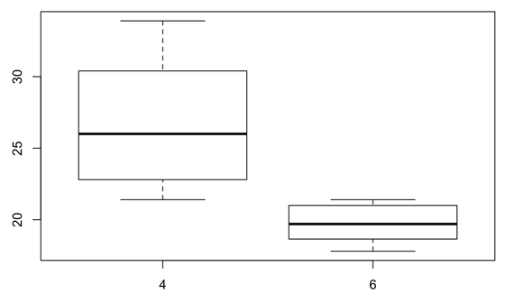
接下來試著畫箱圖,如果想畫出在 cyl < 8 的資料中,mpg 對 cyl 的反應,也就是:
x-axis: cyl < 8
y-axis: mpg, response to cyl |
boxplot 的語法是:
boxplot(formula, data = )
formula 是指兩軸(也就是兩個 variables)的關係,在這裡是:
y ~ x
表示 Y-axis 對 X-axis 的反應,所以也就是:
boxplot(y ~ x, data = )
最後用
subset = 的功能挑出你要的,在這個例子裡就是
cyl < 8。
| boxplot(mpg ~ cyl, data = mtcars, subset= cyl < 8) |
也可以用
%>% 分開寫。
You can use
. as a placeholder when the “data” argument is in the second position.
mtcars %>%
filter(cyl < 8) %>%
boxplot(mpg ~ cyl, data = . ) |
在上面的語法裡,當前面已經表示過用的資料是 mtcars 的時候,後面在 boxplot() 裡面 data 的部分就可以用 "
." 替代,也就是:
data = .
也可以用 ggplot2 來畫圖,用 ggplot 裡的 geom_boxplot() 畫的話,語法就是這樣:
ggplot(mtcars %>%
filter(cyl < 8), aes(factor(cyl), mpg)) +
geom_boxplot() |
因為 cyl 是數字,所以要需要先把它變成 factor,想更了解的話可以參考這篇:
R | ggplot: Point plot & Box plot
也可以先把畫圖要用的資料用
subset() 的功能挑出來,也就是
cyl < 8 的部分。我們可以把挑出來的部分指定成一個新的 data frame,下面我們把指定其為
cyl_sub,然後再用它來畫圖。
cyl_sub <- subset(mtcars, cyl < 8)
ggplot(cyl_sub, aes(factor(cyl), mpg)) + geom_boxplot() |

好了,這篇就先到這吧。