顯示具有 R Studio 標籤的文章。 顯示所有文章

2018年3月31日 星期六

R | ggplot: 整理圖的外觀 - scale, legend

會畫一些基本的圖了以後,這篇要介紹怎麼整理圖的外觀,例如改變兩軸的 scales 或是加標示(legend)等等,讓圖看起來比較清楚又簡單易懂。

關於這篇的課堂講義請看這:R Graphics with Ggplot2 - Day 2

這邊同要需要先跑下面這些 library。

library(ggplot2)
library(dplyr)
data(mpg)
data(diamonds)

同樣是用檔案資料 mpg,下面之前設好的 p1。(解說看這篇

p1 <- ggplot(mpg, aes(displ, hwy))
p1 + geom_point(alpha = 1/5)


可以改變兩軸的名稱,只要在後面加這個:scale_x_continuous(" ")scale_y_continuous(" "),然後在 " " 裡面打入你想要的軸名就好了。

p1 + geom_point(alpha = 1/5) +
   scale_x_continuous("Engine displacement (L)") +
   scale_y_continuous("Highway mileage (miles/gallon)")


或是也可以簡單點用:xlab(' ')ylab(' '),然後在 ' ' 裡面打你要的軸名。

如果要加上圖的名稱或標題,則是在加上:ggtitle(' ')

p1 + geom_point(alpha = 1/5) +
   xlab('Engine displacement (L)') +
   ylab('Highway mileage (miles/gallon)') +
   ggtitle('How engine size relates its highway mileage')

也可以全部寫在一起:labs(x = ' ', y = ' ', title = ' ')

p1 + geom_point(alpha = 1/5) +
   labs(x = 'Engine displacement (L)',
        y = 'Highway mileage (miles/gallon)',
        title = 'How engine size relates its highway mileage')


我們也可以設定 variable 裡面各個觀察的顏色,例如在這個例子裡,我們加入 year 這個變項,然後用顏色區分。

若要加入年份這個 variable,需要在 geom_point 裡面加入:aes(colour = factor(year)

這個指令也可以加在 p1 那層裡面,在這邊為求方便和易理解,所以加在後面。(細節解釋請看這篇這篇

p1 + geom_point(aes(colour = factor(year))) +
     labs(x = 'Engine displacement (L)',
          y = 'Highway mileage (miles/gallon)',
          title = 'How engine size relates its highway mileage')


如果想指定這個年份的顏色,可以用下面的語法設定你要的顏色,也可以設定旁邊圖標(figure legend)的名稱,例如把 factor(year) 改為 Year。

scale_colour_manual(name = " ", values = c(" ", " "))

在名字的地方打入你想要的名稱,在 values = c(" ", " ") 的地方打入你要的顏色。

p1 + geom_point(aes(colour = factor(year))) +
     labs(x = 'Engine displacement (L)',
          y = 'Highway mileage (miles/gallon)',
          title = 'How engine size relates its highway mileage') +
     scale_colour_manual(name = "Year",
                         values = c("light green", "skyblue"))


除此之外,你也可以讓圖標只顯示出你要的觀察,例如說只顯示 2008 年的,並且把它改名為 To Date。

只想顯示某個觀察用:bearks = 
把那個觀察改名用:labels = " "

ggplot(mpg, aes(hwy, cty, colour = factor(year))) +
   geom_point() +
   scale_colour_manual(name = "Year",
                       values = c("light green", "skyblue"),
                       breaks = 2008, labels = "To Date"))


也可以改變圖標的位置,用 theme() 功能裡的 legend.position。

語法是:theme(legend.position = )

p1 + geom_point(aes(colour = factor(year))) +
     labs(x = 'Engine displacement (L)',
          y = 'Highway mileage (miles/gallon)',
          title = 'How engine size relates its highway mileage') +
     scale_colour_manual(name = "Year",
                         values = c("light green""skyblue")) +
     theme(legend.position = 'top')


如果不要圖標,就寫 none:theme(legend.position="none")

如果要更細部的挑整圖標,可以用 guides() 的功能。

對應前面的 colour = factor(year)guides() 功能裡面用的是 colour = guide_legend()。可以在 guide_legend() 裡面設定圖標的標題、位置和格式。

設定標題的話就是直接在 guide_legend() 裡面輸入 "title" (title = 你想要的標題)。

設定位置則是用:label.position = 

也可以把圖標設成兩欄的格式:ncol = 

p1 + geom_point(aes(colour = factor(year))) +
     labs(x = 'Engine displacement (L)',
          y = 'Highway mileage (miles/gallon)',
          title = 'How engine size relates its highway mileage') +
   guides(colour = guide_legend("Year",
                   label.position = "bottom", ncol = 2))


有從上面的圖中看出哪個語法是對應到哪個變化嗎?

接下來,我們用檔案資料 diamonds 來做其他改變。

在之前這一篇有畫過這個圖:

ggplot(diamonds, aes(carat, price)) +
                 geom_point(alpha = 1/15)


可以在其中加入另一個變項 cut,用顏色區分。

ggplot(diamonds, aes(carat, price, colour = cut)) +
                 geom_point(alpha = 1/15)


因為點太多,我們可以隨機挑出兩百個點做試驗,並把圖設為 d1。

隨機挑數的語法是:sample_n(dataframe, #)

d1 <- ggplot(sample_n(diamonds, 200),
      aes(carat, price, colour = cut)) + geom_point()


上面的圖的 Y-axis 間隔都是相同的,我們可以把它改成倍數,也就是用 log 或是 log10。

要改軸的格式可以用上面介紹的 scale_x_continuous()scale_y_continuous()

在這兩個功能裡面可以設軸名、軸的格式、最大值和最小值,還有顯示哪幾個值。

設軸名:name = " " 

設軸上各點的名字:label = c(" ", " ", " ", ...)

例如 X-axis 的標示是 2, 4, 6 的話,可以用 label = c("two", "four", "six") 這個語法改成 two, four, six。

軸的格式可以設成倍數,也就是從原本的 1, 2, 3, .... etc. 轉換成 1, 2, 4, 8, 16, ... etc,用的語法為:trans = "log" 或是 trans = "log10"

最大值和最小值:limits = c(min, max)
也可以用之前介紹過的:xlim(min, max)

只顯示某幾個值:breaks = c(x, y, z, ....)

顯示副軸(minor scale):minor_breaks = (如果沒設的話就是 default 會出現,如果不想要就設 minor_breaks = NULL。)

接下來直接用上面的圖做變化,為了清楚表現以上幾個功能,先從最少的語法開始。下面是

d1 + scale_x_continuous(name = "Carat", limits = c(0.2, 4),
                        breaks = c(0.25, 0.5, 1, 2, 4),
                        minor_breaks = NULL) +
     scale_y_continuous(name = "Price",
                        breaks = 1000 * c(0.5, 1, 2, 4, 8, 16),
                        minor_breaks = NULL)


跟上面的比較,可以看出軸名改了,成為:Price 和 Carat。圖的橫軸變成從 0.2 到 4,軸的點為指定的那四點,各點間依比例設距離,因此畫出來會是 log 的圖。圖的直軸也只顯示設的那幾個點,數字間的距離也是依比例畫的。兩軸皆沒有副軸。

再來加入副軸,也就是把 minor_breaks = NULL 拿掉。然後讓顯示的點都為等距,也就是用 trans = "log" 的功能來畫 log 的圖。

d1 + scale_x_continuous(name = "Carat", limits = c(0.2, 4),
                        trans = "log",
                        breaks = c(0.25, 0.5, 1, 2, 4)) +
     scale_y_continuous(name = "Price", trans = "log10",
                        breaks = 1000 * c(0.5, 1, 2, 4, 8, 16)


再來,我們可以改變圖標的名稱,用的語法是:scale_colour_discrete()

d1 + scale_x_continuous(name = "Carat", limits = c(0.2, 4),
                        trans = "log",
                        breaks = c(0.250.5, 1, 2, 4)) +
     scale_y_continuous(name = "Price", trans = "log10",
                        breaks = 1000 * c(0.5, 1, 2, 4, 8, 16)
     scale_colour_discrete("Cut")


可以看到右邊圖標的名稱改了,如果想要改裡面各個小標的名稱的話,就在功能裡面加:labels = c(" ", " ", " ", ...)


最後,我們用檔案 msleep 來做個練習吧。


Exercise

1. Using the msleep data frame, plot the length of the sleep cycle versus the total amount of sleep. Indicate the animal’s diet by colour. Add appropriate labels to the axes and colour legend, and make the colour key labels more reader-friendly.

ggplot(msleep, aes(sleep_total, sleep_cycle, colour = vore)) +             geom_point() +
       labs(x = "Total sleep (h)",
            y = "Length of sleep cycle",
            title = "Animal Sleep") +
       scale_colour_discrete("Animal Diet",
       labels = c("carnivore", "herbivore",

                  "insectivore", "omnivore", "N/A"))


2. Using the msleep data frame, plot the body weight vs. the brain weight. Indicate the animal’s diet by colour. Add appropriate labels to the axes and colour legend. (Use a log axis if warranted.)

這邊我們會用另一個顏色的功能嘗試:scale_colour_brewer()

用法跟上面的很像,一樣是可以在裡面設定圖標名稱,另外就是這個是調色盤,也可以設定不同的色調,用的語法是:palette = " "

另外,上面介紹的 scale_x_continuous(trans = "log10")scale_y_continuous(trans = "log10") 也可以用較短的 scale_x_log10()scale_y_log10() 代替。

ggplot(msleep, aes(brainwt, bodywt, colour = vore)) +
       geom_point() +
       labs(x = "Brain Weight (kg)",
            y = "Body Weight (kg)",
            title = "Animal Weight") +
       scale_x_log10() + scale_y_log10() +
       scale_colour_brewer("Diet")


如果沒有設定色調的話,預設是藍色。如果想用其他色調的話,可以參考這裡,下面用的是 "Set2"。

ggplot(msleep, aes(brainwt, bodywt, colour = vore)) +
       geom_point() +
       labs(x = "Brain Weight (kg)",
            y = "Body Weight (kg)",
            title = "Animal Weight") +
       scale_x_log10() + scale_y_log10() +
       scale_colour_brewer("Diet", palette = "Set2")


3. Same as Exercise 2, but use the species name instead of a point. Add appropriate labels to the axes and colour legend. (Use a log axis if warranted.)

這邊要把點改成動物名稱,也就是用字去顯示每個點,用的功能是:geom_text()

因為我們要用動物名稱去標示每個點,所以要加入這個指令:label = name

ggplot(msleep, aes(brainwt, bodywt, colour = vore)) +
       geom_text(aes(label = name)) +
       labs(x = "Brain Weight (kg)",
            y = "Body Weight (kg)",
            title = "Animal Weight") +
       scale_x_log10() + scale_y_log10() +
       scale_color_discrete("Diet")


好了,主要的幾個功能大概都介紹了,這篇就先到這邊吧。(總算把這篇打完惹)


2017年12月23日 星期六

R | Data manipulation (2): arrange, mutate, summarise

這篇介紹另外幾個處理資料的功能,上篇請看這裡:R | Data manipulation (1): select, filter, slice

詳細功能介紹請參考這兩頁:Working with Data - Part 1 & Intro to R - Part 3

練習的部分可以參考 slides: Working with Data - Part 1 (pdf)

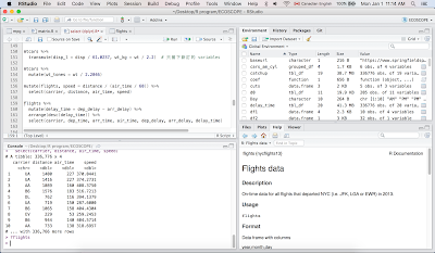
這幾個功能在 dplyr 這個 package 裡面,所以要先跑。同時要用內建檔案 mtcars 來練習,所以也要叫出來。下面還會用檔案資料 flights,因為它在 nycflights13 這個 packages 裡面,所以也需要安裝。

library(dplyr)
library(nycflights13)
mtcars
flights

下面先介紹一個觀看檔案的功能。

Glimpse function: columns run down the page, and data runs across, making it possible to see every column in a data frame

glimpse() 和平常看檔案的方式不一樣。我們平常看檔案的時候,variables 是在第一列(rows),每個欄位(column)是一個 variables。但用 glimpse() 的話,它會橫向顯示每個 variable 的數據值。

下面先用資料檔案 flights 練習。

dim(flights)

dim: 顯示檔案資料的大小 dimension (row x column)

[1] 336776     19

上面顯示的結果告訴我們,共有 336776 個班機(observations),且用 19 個 variables 呈現各個班機的資訊。

glimpse(flights)

Observations: 336,776
Variables: 19
$ year           <int> 2013, 2013, 2013, 2013, 2013, 2013, ...
$ month          <int> 1, 1, 1, 1, 1, 1, 1, 1, 1, 1, 1, 1, ...
$ day            <int> 1, 1, 1, 1, 1, 1, 1, 1, 1, 1, 1, 1, ...
$ dep_time       <int> 517, 533, 542, 544, 554, 554, 555, ...

上面用 glimpse() 功能可以看到每班飛機的資訊(variables)包括有 year, month, day, dep_time 等等。

5. Arrange function: order observations (rows)

沒特別指令的話會由小到大排列。

Default setting: order mpg values from small to large. (依 mpg 的大小排列)

arrange(mtcars, mpg)

    mpg cyl  disp  hp drat    wt  qsec vs am gear carb
1  10.4   8 472.0 205 2.93 5.250 17.98  0  0    3    4
2  10.4   8 460.0 215 3.00 5.424 17.82  0  0    3    4
3  13.3   8 350.0 245 3.73 3.840 15.41  0  0    3    4
4  14.3   8 360.0 245 3.21 3.570 15.84  0  0    3    4
5  14.7   8 440.0 230 3.23 5.345 17.42  0  0    3    4

如果要由大到小排列的話,則用:desc()

Use desc() to sort in descending order.
Order mpg from large to small.

arrange(mtcars, desc(mpg))

    mpg cyl  disp  hp drat    wt  qsec vs am gear carb
1  33.9   4  71.1  65 4.22 1.835 19.90  1  1    4    1
2  32.4   4  78.7  66 4.08 2.200 19.47  1  1    4    1
3  30.4   4  75.7  52 4.93 1.615 18.52  1  1    4    2
4  30.4   4  95.1 113 3.77 1.513 16.90  1  1    5    2
5  27.3   4  79.0  66 4.08 1.935 18.90  1  1    4    1

如果有兩個 variables 的話,會先排第一個,然後再在第一個裡面排第二個的大小順序。

mtcars %>%
   arrange(cyl, gear)

Arrange with cyl first; then within cyl, arrange gear.

上面的例子中,會先依照 cyl 的大小排列,再依 gear 的大小排列。

    mpg cyl  disp  hp drat    wt  qsec vs am gear carb
1  21.5   4 120.1  97 3.70 2.465 20.01  1  0    3    1
2  22.8   4 108.0  93 3.85 2.320 18.61  1  1    4    1
3  24.4   4 146.7  62 3.69 3.190 20.00  1  0    4    2
4  22.8   4 140.8  95 3.92 3.150 22.90  1  0    4    2
5  32.4   4  78.7  66 4.08 2.200 19.47  1  1    4    1

如果想讓兩個 variables 都由大到小排列,可以分開寫,也可以合在一起。

Reorder the mtcars in descending order of mpg and displacement (disp)

mtcars %>%
  arrange(desc(carb), desc(mpg))

或寫成這樣:

mtcars %>%
  arrange(desc(carb, mpg))

    mpg cyl  disp  hp drat    wt  qsec vs am gear carb
1  15.0   8 301.0 335 3.54 3.570 14.60  0  1    5    8
2  19.7   6 145.0 175 3.62 2.770 15.50  0  1    5    6
3  21.0   6 160.0 110 3.90 2.620 16.46  0  1    4    4
4  21.0   6 160.0 110 3.90 2.875 17.02  0  1    4    4
5  19.2   6 167.6 123 3.92 3.440 18.30  1  0    4    4
6  17.8   6 167.6 123 3.92 3.440 18.90  1  0    4    4

從上面可以看到是先依 carb 的大小排列,之後再依 mpg 的大小排列(最後四排當 carb 都是 4 的時候,mpg 是由大到小排列),但兩個都是由大到小。

Exercise

這邊我們用檔案資料 flights 來練習。

Q1. Which flights are the most delayed?

哪個班機起飛時間延遲最多,可以用 desc() 由大到小排列延遲的長度,第一個就是延遲最多的。下面先用 glimpse 呈現結果。

flights %>%
  arrange(desc(dep_delay)) %>%
  glimpse

Observations: 336,776
Variables: 19
$ year           <int> 2013, 2013, 2013, 2013, 2013, ...
$ month          <int> 1, 6, 1, 9, 7, 4, 3, 6, 7, 12, 5, 1, 2, ...
$ day            <int> 9, 15, 10, 20, 22, 10, 17, 27, 22, ...
$ dep_time       <int> 641, 1432, 1121, 1139, 845, 1100, 2321, ...
$ sched_dep_time <int> 900, 1935, 1635, 1845, 1600, 1900, 810, ...
$ dep_delay      <dbl> 1301, 1137, 1126, 1014, 1005, 960, ...

從上面顯示的最後一行 dep_delay 可以看到是由大到小排列。

如果不確定哪個 variable 是指延遲時間的話,可以用 help() 的功能來查看:?flights 或是 help(flights)

會在 R Studio 右下角的視窗中出現解釋框(如下圖,點圖可以放大),裡面寫:

dep_delay, arr_delay:
Departure and arrival delays, in minutes. Negative times represent early departures/arrivals.


下面是沒用 glimpse() 功能呈現,應該會比較清楚。

arrange(flights, desc(dep_delay))

# A tibble: 336,776 x 19
    year month   day dep_time sched_dep_time dep_delay arr_time
   <int> <int> <int>    <int>          <int>     <dbl>    <int>
 1  2013     1     9      641            900      1301     1242
 2  2013     6    15     1432           1935      1137     1607
 3  2013     1    10     1121           1635      1126     1239
 4  2013     9    20     1139           1845      1014     1457
 5  2013     7    22      845           1600      1005     1044
 6  2013     4    10     1100           1900       960     1342
 7  2013     3    17     2321            810       911      135
 8  2013     6    27      959           1900       899     1236
 9  2013     7    22     2257            759       898      121
10  2013    12     5      756           1700       896     1058
# ... with 336,766 more rows, and 11 more variables:
#   carrier &arr_delay <dbl>,lt;chr>, flight <int>, tailnum <chr>,
#   origin <chr>, air_time <dbl>, distance <dbl>, hour <dbl>,
#   minute <dbl>, time_hour <dttm>

Q2: Which flights caught up the most time during the flight?

哪班飛機趕上的時間最多,就是說即便是延遲起飛,但是仍然準時抵達的,也就是延遲時間最短的(比預計的飛行時間短),這邊用延遲起飛的時間減掉延遲抵達的時間,再由大到小排列。

flights %>%
  arrange(desc(dep_delay - arr_delay)) %>%
  glimpse

Observations: 336,776
Variables: 19
$ year           <int> 2013, 2013, 2013, 2013, 2013, 2013, ...
$ month          <int> 6, 2, 2, 5, 2, 7, 7, 12, 5, 11, 5, 5, ...
$ day            <int> 13, 26, 23, 13, 27, 14, 17, 27, 2, 13, ...
$ dep_time       <int> 1907, 1000, 1226, 1917, 924, 1917, ...
$ sched_dep_time <int> 1512, 900, 900, 1900, 900, 1829, 1930, ...

不用 glimpse 顯示:

arrange(flights, desc(dep_delay - arr_delay))

# A tibble: 336,776 x 19
    year month   day dep_time sched_dep_time dep_delay arr_time
   <int> <int> <int>    <int>          <int>     <dbl>    <int>
 1  2013     6    13     1907           1512       235     2134
 2  2013     2    26     1000            900        60     1513
 3  2013     2    23     1226            900       206     1746
 4  2013     5    13     1917           1900        17     2149
 5  2013     2    27      924            900        24     1448
 6  2013     7    14     1917           1829        48     2109
 7  2013     7    17     2004           1930        34     2224
 8  2013    12    27     1719           1648        31     1956
 9  2013     5     2     1947           1949        -2     2209
10  2013    11    13     2024           2015         9     2251
# ... with 336,766 more rows, and 11 more variables:
#   arr_delay <dbl>, carrier <chr>, flight <int>, tailnum <chr>,
#   origin <chr>, dest <chr>, air_time <dbl>, distance <dbl>,
#   hour <dbl>, minute <dbl>, time_hour <dttm>

可以指定 catchup 為 flights,再帶入 arrange,或是用 head 只顯示前十個 carrier。

flights %>%
  arrange(desc(dep_delay - arr_delay))
head(catchup$carrier, 10)

[1] "EV" "HA" "HA" "DL" "HA" "UA" "UA" "UA" "UA" "DL"

如果只看資料的前十個的話,則是下面這樣。

head(flights$carrier, 10)

[1] "UA" "UA" "AA" "B6" "DL" "UA" "B6" "EV" "B6" "AA"


6. Mutate function: 設定新的 variable,新設定的 variable 會顯示在最後一欄。

Make new variables: disp_l and wt_kg

1L = 61.0237 cu.in. (cubic inch)
1kg = 2.2 lbs

檔案資料裡面的 disp 單位是 cu.in.,我們把它轉換成 L,設定其為 disp_l。同時也把裡面原本單位為磅(lbs)的 wt 換算成 kg,指定其為 wt_kg。新訂的 disp_l 和 wt_kg 會顯示在最後兩的 column。

mtcars %>%
 mutate(disp_l = disp/61.0237,
        wt_kg = wt/2.2)

    mpg cyl  disp  hp drat    wt  qsec vs am gear carb   disp_l     wt_kg
1  21.0   6 160.0 110 3.90 2.620 16.46  0  1    4    4 2.621932 1.1909091
2  21.0   6 160.0 110 3.90 2.875 17.02  0  1    4    4 2.621932 1.3068182
3  22.8   4 108.0  93 3.85 2.320 18.61  1  1    4    1 1.769804 1.0545455
4  21.4   6 258.0 110 3.08 3.215 19.44  1  0    3    1 4.227866 1.4613636
5  18.7   8 360.0 175 3.15 3.440 17.02  0  0    3    2 5.899347 1.5636364

把重量換算成噸,指定其為:wt_tonnes
Include a variable for weight in tonnes (1t = 2,204.6 lbs)

mtcars %>%
  mutate(wt_tones = wt / 2.2046)

    mpg cyl  disp  hp drat    wt  qsec vs am gear carb  wt_tones
1  21.0   6 160.0 110 3.90 2.620 16.46  0  1    4    4 1.1884242
2  21.0   6 160.0 110 3.90 2.875 17.02  0  1    4    4 1.3040914
3  22.8   4 108.0  93 3.85 2.320 18.61  1  1    4    1 1.0523451
4  21.4   6 258.0 110 3.08 3.215 19.44  1  0    3    1 1.4583144
5  18.7   8 360.0 175 3.15 3.440 17.02  0  0    3    2 1.5603738


transmute: leave only the new variables

如果用 transmute() 的話,就只會顯示新訂的 disp_1 和 wt_kg。

mtcars %>%
  transmute(disp_l = disp/61.0237, wt_kg = wt/2.2)

     disp_l     wt_kg
1  2.621932 1.1909091
2  2.621932 1.3068182
3  1.769804 1.0545455
4  4.227866 1.4613636
5  5.899347 1.5636364
6  3.687092 1.5727273

Exercise

Q1. Compute speed in mph from time (in minutes) and distance (in miles)

同樣可以用 ?flights 查詢:

distance: Distance between airports, in miles
air_time: Amount of time spent in the air, in minutes

計算飛機的速度:mph = miles per hour

也就是飛行的距離 distance (in miles) 除以飛行的時間 air_time (in minutes)。

因為 air_time 是以分鐘為單位,所以我們必須先把它轉換成小時,也就是:air_time / 60

下面把速度指定為 speed

mutate(flights, speed = distance / (air_time / 60))

# A tibble: 336,776 x 20
    year month   day dep_time sched_dep_time dep_delay arr_time
   <int> <int> <int>    <int>          <int>     <dbl>    <int>
 1  2013     1     1      517            515         2      830
 2  2013     1     1      533            529         4      850
 3  2013     1     1      542            540         2      923
 4  2013     1     1      544            545        -1     1004
 5  2013     1     1      554            600        -6      812
 6  2013     1     1      554            558        -4      740
 7  2013     1     1      555            600        -5      913
 8  2013     1     1      557            600        -3      709
 9  2013     1     1      557            600        -3      838
10  2013     1     1      558            600        -2      753
# ... with 336,766 more rows, and 12 more variables:
#   arr_delay <dbl>, carrier <chr> flight <int>, tailnum <chr>,
#   origin <chr>, dest <chr>, air_time <dbl>,  distance <dbl>,
#   hour <dbl>, minute <dbl>, time_hour <dttm>, speed <dbl>

顯示整個檔案太長,看不到後面計算出來的 speed,所以用 select() 的功能挑出我們想看的幾個 variables。如果忘記 select() 是什麼、怎麼用的話,可以看前一篇

mutate(flights, speed = distance / (air_time / 60)) %>%
  select(carrier, distance, air_time, speed)

# A tibble: 336,776 x 4
   carrier distance air_time    speed
     <chr>    <dbl>    <dbl>    <dbl>
 1      UA     1400      227 370.0441
 2      UA     1416      227 374.2731
 3      AA     1089      160 408.3750
 4      B6     1576      183 516.7213
 5      DL      762      116 394.1379
 6      UA      719      150 287.6000
 7      B6     1065      158 404.4304
 8      EV      229       53 259.2453
 9      B6      944      140 404.5714
10      AA      733      138 318.6957
# ... with 336,766 more rows

Q2. Which flight flew the fastest?

哪個班機的速度最快?可以用 arrange() 功能由大到小排列出來,跟上面一樣只挑出我們想看的幾個 variables 來看。

flights %>%
  mutate(speed = distance / (air_time / 60)) %>%
  arrange(desc(speed)) %>%
  select(carrier, distance, air_time, speed)

# A tibble: 336,776 x 4
   carrier distance air_time    speed
     <chr>    <dbl>    <dbl>    <dbl>
 1      DL      762       65 703.3846
 2      EV     1008       93 650.3226
 3      EV      594       55 648.0000
 4      EV      748       70 641.1429
 5      DL     1035      105 591.4286
 6      DL     1598      170 564.0000
 7      B6     1598      172 557.4419
 8      AA     1623      175 556.4571
 9      DL     1598      173 554.2197
10      B6     1598      173 554.2197
# ... with 336,766 more rows

Q3. 把上面班機延遲練習的 Q2,用 select() 的功能挑出我們想看的幾項出來。

flights %>%
  mutate(delay_time = dep_delay - arr_delay) %>%
  arrange(desc(delay_time)) %>%
  select(carrier, dep_time, arr_time, air_time,
         dep_delay, arr_delay, delay_time)

# A tibble: 336,776 x 7
   carrier dep_time arr_time air_time dep_delay arr_delay delay_time
     <chr>    <int>    <int>    <dbl>     <dbl>     <dbl>      <dbl>
 1      EV     1907     2134      126       235       126        109
 2      HA     1000     1513      584        60       -27         87
 3      HA     1226     1746      599       206       126         80
 4      DL     1917     2149      313        17       -62         79
 5      HA      924     1448      589        24       -52         76
 6      UA     1917     2109      274        48       -26         74
 7      UA     2004     2224      295        34       -40         74
 8      UA     1719     1956      324        31       -42         73
 9      UA     1947     2209      300        -2       -75         73
10      DL     2024     2251      311         9       -63         72
# ... with 336,766 more rows

可以和上面排列前十的 carrier 的結果比對,看排列是不是一樣的。


7. Summarise / Summarize

功能和 mutate() 有點像,不一樣的是它會產生一個新的 data frame,並且是那欄(也就是那個 variable)所有觀察資料的總結。

Summarise works in an analogous way to mutate, except instead of adding columns to an existing data frame, it creates a new data frame. This is particularly useful in conjunction with ddply as it makes it easy to perform group-wise summaries.

例如算出 mpg 的平均值,可以用 mean() 的功能這樣算:

mean(mtcars$mpg)

[1] 20.09062

如果用 mutate() 的話會是這樣:

mutate(mtcars, mean(mpg))

    mpg cyl  disp  hp drat    wt  qsec vs am gear carb mean(mpg)
1  21.0   6 160.0 110 3.90 2.620 16.46  0  1    4    4  20.09062
2  21.0   6 160.0 110 3.90 2.875 17.02  0  1    4    4  20.09062
3  22.8   4 108.0  93 3.85 2.320 18.61  1  1    4    1  20.09062
4  21.4   6 258.0 110 3.08 3.215 19.44  1  0    3    1  20.09062
5  18.7   8 360.0 175 3.15 3.440 17.02  0  0    3    2  20.09062

同樣是算出 mean,但它會放在最後一欄,所以所有數值都一樣,因為它是全部觀察算出來的平均值。

如果用 summarise() 的話則是這樣,以一個 data frame 的樣式呈現出來:

summarise(mtcars, mean(mpg))

  mean(mpg)
1  20.09062

也可以幫平均值指定一個名稱 mpg_mean,直接寫在裡面即可。

summarise(mtcars, mpg_mean = mean(mpg)

  mpg_mean
1 20.09062

也可以設定三個,例如把 mpg 的平均值設為 mean_mpg,把重量的中間值設為 median_wt,然後把這兩者的比例設為 ratio

找出中間值用的功能是:median()

mtcars %>%
  summarise(mean_mpg = mean(mpg),
            median_wt = median(wt),
            ratio = mean_mpg/median_wt)

  mean_mpg median_wt    ratio
1 20.09062     3.325 6.042293

也可以全部寫在一行,下面同時把 mpg 的平均值直接設為 mpg,wt 的中間值設為 wt,把兩者的比例設為 ratio

summarise(mtcars, mpg = mean(mpg),
                  wt = median(wt),
                  ratio = mpg/wt)

       mpg    wt    ratio
1 20.09062 3.325 6.042293

除了算全部的平均值外,也可以分組算,例如算出 cyl 裡各種觀察值的平均值。下面先用 levels() 看 cyl 裡面有哪幾種,因為 cyl 的觀察值是數字,需要先把它換成 factor。

levels(factor(mtcars$cyl))

[1] "4" "6" "8"

由上面結果可以看出 cyl 的觀察值有三種:4, 6, 8。如果要看各個的 mpg 和重量平均值,可以用 group_by() 的功能。

mtcars %>%
  group_by(cyl) %>% 
  summarise(mean_mpg = mean(mpg), median_wt = median(wt))

# A tibble: 3 x 3
    cyl mean_mpg median_wt
  <dbl>    <dbl>     <dbl>
1     4 26.66364     2.200
2     6 19.74286     3.215
3     8 15.10000     3.755

也可以在一組裡面再分組算平均值,例如先用 am 分組後,在再裡面用 cyl 分組,先分的那個放前面,所以語法會是:group_by(am, cyl)

mtcars %>%
  group_by(am, cyl) %>%
  summarise(mpg = mean(mpg), wt = median(wt))

# A tibble: 6 x 4
# Groups:   am [?]
     am   cyl      mpg     wt
  <dbl> <dbl>    <dbl>  <dbl>
1     0     4 22.90000 3.1500
2     0     6 19.12500 3.4400
3     0     8 15.05000 3.8100
4     1     4 28.07500 2.0375
5     1     6 20.56667 2.7700
6     1     8 15.40000 3.3700

因為用 summarise() 算出來的結果本身就會轉換成一個 data frame,所以可以把這個 data frame 指定一個名稱,例如為 cars_am_cyl,這樣之後想要看的時候便不需要打全部的語法,只要叫出 cars_am_cyl 即可看。

cars_am_cyl <- mtcars %>%
  group_by(am, cyl) %>%
  summarise(mpg = mean(mpg), wt = median(wt))

cars_am_cyl

因為 cars_am_cyl 已經是一個 data frame,也可以直接用它來做運算,因為上面設定時已經先用 am 分好組了,所以算平均值的時候會依這個分。

cars_am_cyl %>%
  summarise(mpg = mean(mpg), wt = median(wt))

# A tibble: 2 x
     am      mpg    wt
  <dbl>    <dbl> <dbl>
1     0 19.02500  3.44
2     1 21.34722  2.77

也可以相反設試試看,先用 cyl 分組後再依 am 分組運算,也就是 group_by(cyl, am),然後和上面比較有何不同。

cars_cyl_am <- mtcars %>%
  group_by(cyl, am) %>%
  summarise(mpg = mean(mpg), wt = median(wt))

cars_cyl_am

# A tibble: 6 x 4
# Groups:   cyl [?]
    cyl    am      mpg     wt
  <dbl> <dbl>    <dbl>  <dbl>
1     4     0 22.90000 3.1500
2     4     1 28.07500 2.0375
3     6     0 19.12500 3.4400
4     6     1 20.56667 2.7700
5     8     0 15.05000 3.8100
6     8     1 15.40000 3.3700

因為上面是先用 cyl 分組,所以接下來用 cars_cyl_am 來做運算的話,會算出 cyl 裡各組的平均值。

cars_cyl_am %>%
  summarise(mpg = mean(mpg), wt = median(wt))

# A tibble: 3 x 3
    cyl      mpg      wt
  <dbl>    <dbl>   <dbl>
1     4 25.48750 2.59375
2     6 19.84583 3.10500
3     8 15.22500 3.59000

Exercise

Q1. Compute the minimum and maximum displacement for each engine type (vs) by transmission type (am)

在各個引擎的種類中依 am 分組後,找出其中的最大值和最小值,因此要先依引擎分類,再在其中依 am 分組,也就是:group_by(vs, am)

最大值和最小值的功能為:max()min()

mtcars %>%
  group_by(vs, am) %>%
  summarise(min = min(disp), max = max(disp))

# A tibble: 4 x 4
# Groups:   vs [?]
     vs    am   min   max
  <dbl> <dbl> <dbl> <dbl>
1     0     0 275.8   472
2     0     1 120.3   351
3     1     0 120.1   258
4     1     1  71.1   121

Q2. Which destinations have the highest average delays?

flights %>%
  group_by(dest) %>%
  summarise(avg_delay = mean(arr_delay, na.rm = TRUE)) %>%
  arrange(desc(avg_delay))

# A tibble: 105 x 2
    dest avg_delay
   <chr>     <dbl>
 1   CAE  41.76415
 2   TUL  33.65986
 3   OKC  30.61905
 4   JAC  28.09524
 5   TYS  24.06920
 6   MSN  20.19604
 7   RIC  20.11125
 8   CAK  19.69834
 9   DSM  19.00574
10   GRR  18.18956
# ... with 95 more rows
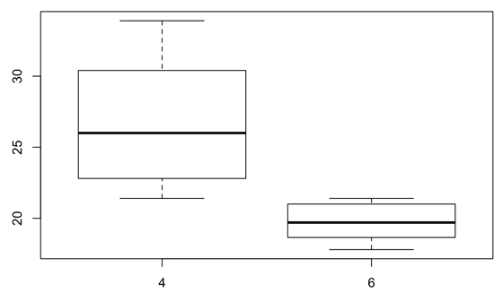

8. Boxplot

接下來試著畫箱圖,如果想畫出在 cyl < 8 的資料中,mpg 對 cyl 的反應,也就是:

x-axis: cyl < 8
y-axis: mpg, response to cyl

boxplot 的語法是:boxplot(formula, data = )

formula 是指兩軸(也就是兩個 variables)的關係,在這裡是: y ~ x 

表示 Y-axis 對 X-axis 的反應,所以也就是:boxplot(y ~ x, data = )

最後用 subset =  的功能挑出你要的,在這個例子裡就是 cyl < 8

boxplot(mpg ~ cyl, data = mtcars, subset= cyl < 8)


也可以用 %>% 分開寫。

You can use . as a placeholder when the “data” argument is in the second position.

mtcars %>%
  filter(cyl < 8) %>%
  boxplot(mpg ~ cyl, data = . )

在上面的語法裡,當前面已經表示過用的資料是 mtcars 的時候,後面在 boxplot() 裡面 data 的部分就可以用 "." 替代,也就是:data = . 

也可以用 ggplot2 來畫圖,用 ggplot 裡的 geom_boxplot() 畫的話,語法就是這樣:

ggplot(mtcars %>%
         filter(cyl < 8), aes(factor(cyl), mpg)) +
  geom_boxplot()

因為 cyl 是數字,所以要需要先把它變成 factor,想更了解的話可以參考這篇:R | ggplot: Point plot & Box plot

也可以先把畫圖要用的資料用 subset() 的功能挑出來,也就是 cyl < 8 的部分。我們可以把挑出來的部分指定成一個新的 data frame,下面我們把指定其為 cyl_sub,然後再用它來畫圖。

cyl_sub <- subset(mtcars, cyl < 8)

ggplot(cyl_sub, aes(factor(cyl), mpg)) + geom_boxplot()


好了,這篇就先到這吧。


2017年12月4日 星期一

R | ggplot: summary & error bar

這篇要講的應該是很常會用到的,就是加 error bar。

課堂講義請看這:R Graphics with Ggplot2 - Day 3

這邊我們要用到檔案資料 diamonds。

library(ggplot2)
library(dplyr)
data(diamonds)

我們先用 xtabs() 來看檔案中 color 的分佈情形。(xtabs() 的功能請看這篇。)

xtabs(~ color, diamonds)

Table 1
color
    D     E     F     G     H     I     J
 6775  9797  9542 11292  8304  5422  2808 

下面用 bar graph 看分佈,然後和上面做比對。

ggplot(diamonds, aes(color)) + geom_bar()

也可以分開設:(這個部分可以參考這篇會比較清楚)

d <- ggplot(diamonds, aes(color))
d + geom_bar()

#1 (color only)


接著,來看看每種 color 的價格,這裡可以用 by() function 來看每種鑽石顏色的價格總整理(summary)。

語法:by(response var, predictor var, summary)

這裡的 predictor variable (又稱 explanatory or independent variable)通常是個 factor (不是數字),會放在圖的 X-axis,response (or dependent) variable 指的是對應 factor 出現的反應,因此通常是放在圖的 Y-axis。

by(diamonds$price, diamonds$color, summary)

Table 2
diamonds$color: D
   Min. 1st Qu.  Median    Mean 3rd Qu.    Max.
    357     911    1838    3170    4214   18690
----------------------------------------------------------
diamonds$color: E
   Min. 1st Qu.  Median    Mean 3rd Qu.    Max.
    326     882    1739    3077    4003   18730
----------------------------------------------------------
diamonds$color: F
   Min. 1st Qu.  Median    Mean 3rd Qu.    Max.
    342     982    2344    3725    4868   18790
----------------------------------------------------------
diamonds$color: G
   Min. 1st Qu.  Median    Mean 3rd Qu.    Max.
    354     931    2242    3999    6048   18820
----------------------------------------------------------
diamonds$color: H
   Min. 1st Qu.  Median    Mean 3rd Qu.    Max.
    337     984    3460    4487    5980   18800
----------------------------------------------------------
diamonds$color: I
   Min. 1st Qu.  Median    Mean 3rd Qu.    Max.
    334    1120    3730    5092    7202   18820
----------------------------------------------------------
diamonds$color: J
   Min. 1st Qu.  Median    Mean 3rd Qu.    Max.
    335    1860    4234    5324    7695   18710 

也可以用 tapply() 功能來看。

tapply(diamonds$price, diamonds$color, summary)

$D
   Min. 1st Qu.  Median    Mean 3rd Qu.    Max.
    357     911    1838    3170    4214   18690

$E
   Min. 1st Qu.  Median    Mean 3rd Qu.    Max.
    326     882    1739    3077    4003   18730

$F
   Min. 1st Qu.  Median    Mean 3rd Qu.    Max.
    342     982    2344    3725    4868   18790

$G
   Min. 1st Qu.  Median    Mean 3rd Qu.    Max.
    354     931    2242    3999    6048   18820

$H
   Min. 1st Qu.  Median    Mean 3rd Qu.    Max.
    337     984    3460    4487    5980   18800

$I
   Min. 1st Qu.  Median    Mean 3rd Qu.    Max.
    334    1120    3730    5092    7202   18820

$J
   Min. 1st Qu.  Median    Mean 3rd Qu.    Max.
    335    1860    4234    5324    7695   18710 

如果只想看平均值,就把 summary 改成 mean。

tapply(diamonds$price, diamonds$color, mean)

       D        E        F        G        H        I        J
3169.954 3076.752 3724.886 3999.136 4486.669 5091.875 5323.818

在圖裡,可以用 summary_bin 這個功能來看,語法是:stat = "summary_bin"

或是:stat = "summary" (這兩個是一樣的)

summary_bin 裡面的功能有:fun.data, fun.y, fun.ymax (設最大值), fun.ymin (設最小值)

ggplot(diamonds, aes(color, price)) +
       geom_bar(stat = "summary_bin", fun.y = "mean")

在上面的語法裡,Y-axis 雖然已經設好是 price,但你需要在 geom_bar() 裡面的設定 Y-axis 是 price 的平均值(mean)或是中間值(median)等等,設定的語法是:fun.y = 

也可以用上面的已設定好的 d <- ggplot(diamonds, aes(color)) 把上面的語法改成下面這樣:(上面的語法是把 Y-axis 設在 ggplot() 裡面,但是 d 裡面只設了 X-axis,所以在下面的語法中,需要把 Y-axis 設在 geom_bar() 裡面。)

d + geom_bar(aes(y = price),
             stat = "summary_bin", fun.y = "mean")

#2 (color vs. price mean)


可以把圖和上面的 summary 表格做比較,看畫出來的是不是 mean。(和上面不同的是表一和圖一的指的是每種顏色的鑽石有幾個,所以圖 #1 的 Y-axis 是 count,而表二和圖二不只是每種顏色有幾個,而是每種鑽石顏色的價格,所以它的 Y-axis 指的不只是價格,還要指定是每種鑽石顏色的平均價格,還是每鑽石顏色其價格的中間值等等。)

下面來畫看看 median 的圖。

d + geom_bar(aes(y = price),
             stat = "summary_bin", fun.y = "median")

#3 (color vs. price median)


除了用 geom_bar(),我們也可以直接用 stat_summary_bin()stat_summary() 的功能。

stat_summary: summarise y values at distinct x values.

ggplot(diamonds, aes(color, price)) +
       stat_summary_bin(fun.y = "mean", geom = "bar")

或是用上面設好的 d。stat_summary_bin() 和 stat_summary() 是一樣的東西,上面和下面的這兩個語法畫出來的圖和上面用 geom_bar() 畫出來的 mean 那張圖是一樣的(圖 #2)。

d + stat_summary(aes(y = price),
                 fun.y = "mean", geom = "bar")

我們也可以畫點圖,用 geom_point() 就是下面那樣:

ggplot(diamonds, aes(color, price)) +
       geom_point(stat = "summary_bin", fun.y = "mean")

#4


上圖的 Y-axis 不是從 0 開始,而是從三千,我們可以把它設成從 0 開始。下面用上面設好的 d 和 stat_summary來畫圖,但基本上跟上面是一樣的,只是多了 ylim() 的語法。

ylim(min, max): Y-axis 的最小值和最大值

在下面的語法中,Y-axis 的最小值我們設為 0,最大值沒設,用 NA。

d + stat_summary(aes(y = price),
                 fun.y = mean, geom = "point") +
    ylim(0, NA)

#5


可以看到上圖的 Y-axis 是從 0 開始,而不是像圖 #4 那樣從三千開始。

接下來,試試在圖中加個 error bar,有四種方法。

注意,下面四種的預設都是 standard error (SE),除非你有指定另外的算法在裡面。

1. geom_pointrange(): vertical line with centre (中間點和其 error bar / standard error)

ggplot(diamonds, aes(color, price)) +
       geom_pointrange(stat = "summary_bin")


我們可以改變點和其 error bar 的大小和顏色。

ggplot(diamonds, aes(color, price)) +
       geom_pointrange(stat = "summary_bin",
                       size = 0.2, color = 'blue')

## No summary function supplied, defaulting to `mean_se()


summary_bin 裡面的 error bar 預設是 standard error (SE),你也可以把他設成別的,例如把它設成最大值 fun.ymax = max 和最小值 fun.ymin = min

ggplot(diamonds, aes(color, price)) +
       geom_pointrange(stat = "summary",
                       fun.y = mean,
                       fun.ymin = min,
                       fun.ymax = max)


可以把 pointrange() 和其他圖合在一起,這裡要注意一下,放在後面的會覆蓋住前面的,所以需要把 geom_point() 放在 geom_pointrange() 後面,如果相反的話會在圖裡看不出 geom_point() 裡面的設定。下面把兩個用不同顏色和不同大小的點區分。

ggplot(diamonds, aes(color, price)) +
       geom_pointrange(stat = "summary_bin",
                       size = 0.5, color = 'red') +
       geom_point(stat = "summary_bin", fun.y = "mean",
                  size = 1.5, color = 'blue')


Error bar 除了以上兩種外,也可以設其他的,例如讓它的範圍為中間 50%,最小值為第 25%,最大值為第 75%。

下面先用 group_by() 的功能把 color 分類,然後再用 summarize() 的功能在每種顏色裡算出其的價格。先把每種顏色的平均價格設為 y = mean(price),把誤差值(SE)的最小值指定為 ymin,設其為每種鑽石顏色的第 25%;把最大值指定為 ymax,設其為每種顏色的第 75%。

ps. quantile 分為:0 (0%), 0.25 (25%), 0.75 (75%), 1 (100%)

在下面先把算出來的指定為一個 data frame:df_color_price

df_color_price <- group_by(diamonds, color) %>%
  summarize(ymin = quantile(price, 0.25),
            ymax = quantile(price, 0.75),
            y = mean(price)),
            n = n())

# A tibble: 7 x 5
  color   ymin    ymax        y     n
  <ord>  <dbl>   <dbl>    <dbl> <int>
1     D  911.0 4213.50 3169.954  6775
2     E  882.0 4003.00 3076.752  9797
3     F  982.0 4868.25 3724.886  9542
4     G  931.0 6048.00 3999.136 11292
5     H  984.0 5980.25 4486.669  8304
6     I 1120.5 7201.75 5091.875  5422
7     J 1860.5 7695.00 5323.818  2808

上面語法中的 n() 是指在那個分類裡有幾個,在 R 裡面的解釋是:"The number of observations in the current group."(也就是說,上面得出的 n 的數字應該是要表 #1 裡的是一樣的。)

從上面的表可以看出 summarize() 算出每種鑽石顏色的平均價格(y)和前後 25% 的價格(ymin, ymax),還有每種顏色的鑽石有多少個(n),接著我們用這個 data frame 畫圖。

ggplot(df_color_price, aes(color, y,
                       ymin = ymin, ymax = ymax)) +
       geom_pointrange() +
       geom_point(aes(size = n))

在前面 df_color_price 的語法裡加入 n = n() 是要讓點圖裡的點會依據每種顏色的數量呈現出不同的大小,例如在前面 pointrange() 的例子裡加入 size =  的話可以指定點的大小。之前都是設數字(例如 size = 2),但是在這裡設 size = n 的話,因為在前面已經設了 n = n(),表示 n 是每種顏色的數量的話,那點的大小就會因數量而異。

也可以把上面兩個語法用 %>% 合在一起。

group_by(diamonds, color) %>%
         summarize(ymin = quantile(price, 0.25),
                   ymax = quantile(price, 0.75),
                   y = mean(price),
                   n = n()) %>%
ggplot(aes(color, y, ymin = ymin, ymax = ymax)) +
       geom_pointrange() +
       geom_point(aes(size = n))


也可以和 geom_bar() 合用。

ggplot(diamonds, aes(color, price)) +
       geom_bar(stat = "summary", fun.y = "mean") +
       geom_pointrange(stat = "summary",
                       size = 0.1, color = 'blue')


在上面的圖中,因為每種鑽石顏色的 standard error (SE) 很小,所以看不出來。

可以用上面已經設好的 df_color_price 來畫圖:

ggplot(df_color_price, aes(color, y,
                       ymin = ymin, ymax = ymax)) +
        geom_bar(stat = "summary") +
        geom_pointrange(size = 0.2, color = 'blue')

因為在 geom_pointrange() 裡面並沒有設 stat = "summary",所以圖呈現出來的會是設在第一層 ggplot() 裡的 error bar (ymin, ymax)。

也可以用 %>% 把兩個語法合在一起,變成下面這樣:(這裡沒用 n = n() 是因為並非畫點圖,所以不需要。)

group_by(diamonds, color) %>%
  summarize(ymin = quantile(price, 0.25),
            ymax = quantile(price, 0.75),
            y = mean(price)) %>%
ggplot(aes(color, y, ymin = ymin, ymax = ymax)) +
       geom_bar(stat = "summary") +
       geom_pointrange(size = 0.2, color = 'blue')


下面把 geom_pointrange() 和 geom_line() 合在一起用。

ggplot(diamonds, aes(color, price)) +
     geom_pointrange(stat = "summary_bin",
                     size = 0.2, color = 'steelblue') +
     geom_line(stat = "summary_bin", fun.y = "mean",
               group = 1, alpha = 1/2)


geom_line() 裡面的語法可以參考這篇:ggplot | Regression Line & Grouping

2. geom_linerange(): vertical line (只有一條直線 error bar / standard error)

如果單用的話就會像下圖那樣只有一條線,所以通常會和其他圖和用。

ggplot(diamonds, aes(color, price)) +
       geom_linerange(stat = "summary_bin")


可以和點圖和 bar graph 合用。和點圖一起用的話,其實畫出來的圖會跟只用 pointrange 差不多。你也可以幫 geom_linerange() 指定顏色,就是那條代表 SE 的直線,可以設成和點不一樣的顏色,如果直接用 pointrange() 的話就無法用不同的顏色。

ggplot(diamonds, aes(color, price)) +
       geom_point(stat = "summary_bin", fun.y = "mean",
                  size = 2, color = 'skyblue') +
       geom_linerange(stat = "summary_bin", color = 'blue')


同樣可以和 bar graph 合用。

ggplot(diamonds, aes(color, price)) +
       geom_bar(stat = "summary_bin", fun.y = "mean") +
       geom_linerange(stat = "summary_bin", color = 'red')


預設的 SE 跟之前 pointrange 的圖一樣太小看不出來,下面再用之前設的 df_color_price 再畫一次。

ggplot(df_color_price, aes(color, y,
                       ymin = ymin, ymax = ymax)) +
       geom_bar(stat = "summary") +
       geom_linerange(size = 0.5, color = 'steelblue')


geom_linerange() 裡面的 size =  是條線條的粗細。

3. geom_errorbar(): error bars.

如果只有 error bar 的話是這樣:

ggplot(diamonds, aes(color, price)) +
       geom_errorbar(stat = "summary_bin")


通常都是和 bar graph 合在一起用。

ggplot(diamonds, aes(color, price)) +
       geom_bar(stat = "summary", fun.y = "mean") +
       geom_errorbar(stat = "summary",
                     width = 0.1, color = 'grey')


geom_errorbar() 裡面的 width =  是用來設 error bar 的寬度。

下面用上面設好的 df_color_price 再畫一次。

ggplot(df_color_price, aes(color, y,
                           ymin = ymin, ymax = ymax)) +
       geom_bar(stat = "summary") +
       geom_errorbar(width = 0.1, color = 'steelblue')


4. geom_crossbar(): vertical bar with center.

終於來到最後一個。只用 geom_crossbar() 的話是這樣:

ggplot(diamonds, aes(color, price)) +
       geom_crossbar(stat = "summary_bin")


用上面的 df_color_price 畫圖:

ggplot(df_color_price, aes(color, y,
                           ymin = ymin, ymax = ymax)) +
       geom_crossbar(width = 0.2, color = 'steelblue')


接下來我想用檔案資料 mpg,用裡面的 class (X-axis) 和 cty (Y-axis) 畫圖。下面跟前面一樣先做總整理。

by(mpg$cty, mpg$class, summary)

mpg$class: 2seater
   Min. 1st Qu.  Median    Mean 3rd Qu.    Max.
   15.0    15.0    15.0    15.4    16.0    16.0
----------------------------------------------------------
mpg$class: compact
   Min. 1st Qu.  Median    Mean 3rd Qu.    Max.
  15.00   18.00   20.00   20.13   21.00   33.00
----------------------------------------------------------
mpg$class: midsize
   Min. 1st Qu.  Median    Mean 3rd Qu.    Max.
  15.00   18.00   18.00   18.76   21.00   23.00
----------------------------------------------------------
mpg$class: minivan
   Min. 1st Qu.  Median    Mean 3rd Qu.    Max.
  11.00   15.50   16.00   15.82   17.00   18.00
---------------------------------------------------------
mpg$class: pickup
   Min. 1st Qu.  Median    Mean 3rd Qu.    Max.
      9      11      13      13      14      17
----------------------------------------------------------
mpg$class: subcompact
   Min. 1st Qu.  Median    Mean 3rd Qu.    Max.
  14.00   17.00   19.00   20.37   23.50   35.00
----------------------------------------------------------
mpg$class: suv
   Min. 1st Qu.  Median    Mean 3rd Qu.    Max.
   9.00   12.00   13.00   13.50   14.75   20.00 

把點圖和 crossbar 合用:

ggplot(mpg, aes(class, cty)) +
       geom_point(alpha = 0.5) +
       geom_crossbar(stat = "summary",
                     width = 0.2, color = 'red')


也可以像上面一樣,把 error bar 設為中間的 50%。

df_mpg <- group_by(mpg, class) %>%
  summarize(cty_ymin = quantile(cty, 0.25),
            cty_ymax = quantile(cty, 0.75),
            y = mean(cty))

ggplot(df_mpg, aes(class, y,
                   ymin = cty_ymin,
                   ymax = cty_ymax)) +
       geom_crossbar(width = 0.2, color = 'steelblue') +
       ylim(10, 35)


我把上面的 Y-axis 設了最大值和最小值 ylim(10,35),讓它和上面點和 crossbar 合圖的 scale 相同,比較好做比較。上面總整理的表格有 1st Qu. 和 3rd Qu.,Qu. 即是 quantile;1st Qu. 就是第一個 quantile,即第 25% ;3rd Qu. 是第三個 quantile,即第 75%。也就是說 1st Qu. 和 3rd Qu. 即是我們在 df_mpg 裡設的 cty_ymin 和 cty_ymax。可以把 crossbar 的最大值和最小值和表格裡的 1st. Qu 和 3rd Qu. 做比對,看看是否一樣。

下面同樣是把點圖和 crossbar 合用,但是用 stat_summary() 來畫。在 error bar 的部分另外設成 sd,用的是 package "Hmisc" 裡面的 mean_sdl

mean_sdl: smean.sdl computes the mean plus or minus a constant times the standard deviation

library(Hmisc)

ggplot(mpg, aes(class, cty)) +
       geom_point(alpha = 0.5) +
       stat_summary(aes(y = cty), fun.y = mean,
                    fun.data = mean_sdl,
                    width = 0.2, color = 'pink',
                    geom = "crossbar")


mean_cl_normal: computes 3 summary variables: the sample mean and lower and upper Gaussian confidence limits based on the t-distribution.

ggplot(mpg, aes(class, cty)) +
       geom_point(alpha = 0.5) +
       stat_summary(aes(y = cty), fun.y = mean,
                    fun.data = mean_cl_normal,
                    width = 0.2, color = 'pink',
                    geom = "crossbar")


最後,來練習一下。

比較 cut 和 depth 的關係,用點畫出中間值(median)和中間 50% 的 error bar。

group_by(diamonds, cut) %>%
  summarize(ymin = quantile(depth, 0.25),
            ymax = quantile(depth, 0.75),
            y = median(depth),
            n = n()) %>%
  ggplot(aes(cut, y, ymin = ymin, ymax = ymax)) +
  geom_pointrange(color = 'steelblue') +
  geom_point(aes(size = n), color = 'skyblue')


【 其他補充 】

有的地方可以看到 stat = "identity",這和 stat = "summary_bin" 有什麼不同呢?

stat = "identity" 通常是用在每個項目只有一個,例如在 diamonds 的檔案裡面,每個 color 的觀察只有一個,也就是說當你畫 price vs. color 的圖的時候,每個 color 裡不需要算價格的平均值或找它的中間值,因為就只有一個數(一個觀察)可以畫在 Y-axis。但是當資料變多的時候,也就是每種 color 裡面有好幾個,每個都是不同的價格的時候,那你畫 price vs. color 時就需要算出每種 color 的平均值,才能畫出 Y-axis,這時候就需要用 stat = "summary_bin" 來算出平均值或找出中間值。

另外,當你沒設 stat = " "  的時候,geom_bar() 裡的預設是 stat = "bin"

ggplot2: geom_bar() 網頁裡的解釋是這樣:

The heights of the bars commonly represent one of two things: either a count of cases in each group, or the values in a column of the data frame. By default, geom_bar uses stat="bin". This makes the height of each bar equal to the number of cases in each group, and it is incompatible with mapping values to the y aesthetic. If you want the heights of the bars to represent values in the data, use stat="identity" and map a value to the y aesthetic.


其他網頁參考:

My ggplot2 cheat sheet: Search by task

R document / ggplot2: geom_bar() function

ggplot 2 / Bar charts

ggplot2 / Vertical intervals: lines, crossbars & errorbars

ggplot2 / Summarise y values at unique/binned x